As first semester of senior year is winding down, the question on my mind is always: "What next?" The response is always a large sigh and a shrug, because I have absolutely no idea what my future is going to entail. Basically the only thing I know for certain is that I want to work in the advertising field. Doing what, who knows? I am not sure whether to go into the account side, or media, or research, or creative. I don't even know if I want to work in an actual agency or do in-house things for certain companies.
However, I do know one other thing: I'm very interested in the field of hospitality. When I was studying abroad in Australia, I took a hospitality course that taught me the basics of the food and beverage as well as the accommodation industries, and that sparked an interest for me. I also love to travel and have been thinking about possibly pursuing a career involving advertising and travel agencies, or something similar.
An ad agency that I recently discovered in Chicago, called Two by Four, is a place where I can see myself working. The website is very welcoming and also easy to navigate. The section describing the workers of the agency is creative and funny, which shows that the people have a good sense of humor. Two by Four is also affiliated with other agencies like SPLNTR, a design and interactive agency, which shows that Two by Four is keeping up with the trends.
For one of their clients, Four Winds Casino Resort, the agency made a wide variety of different advertisements, including TV spots, radio ads, print ads, billboards, banner ads, interactive ads, and even rewards cards. I like how they didn't stick with just one medium.
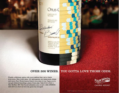
I really like this ad because it uses the combination technique to display the multiple qualities that the Casino Resort has. Not only is it a great place to socialize (displayed by the drinking wine aspect) and stay, but it is also a great place to gamble! The copy is friendly and conversational, and also very convincing. If I lived in the Midwest, I wouldn't feel obligated to travel to Las Vegas after seeing this campaign. I would want to stay and go to Four Winds. The contrast between the red and the white is very effective and mind-grabbing, and I like that the background is blurry. It demonstrates the fact that Four Winds is a really fun place because the blurry-ness is filled with people talking (or at least that's what I see). I like this print ad and I think it would definitely catch my attention as I was flipping through the pages of a magazine.
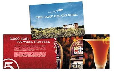
This is an interesting concept because I think that the agency created a rewards program for Four Winds Casino Resort. I believe that this is a pamphlet explaining the program. The images used are very enticing, and I really like the tagline "The game has changed." It is saying that you don't need to spend so much money to go to Las Vegas to gamble and have fun. Four Winds offers everything that a Las Vegas hotel and casino offer, but even better, because it is a "lucky" place to be. A lot of people win big- so why can't you too? The game has changed because you no longer have to spend so much money in order to try to win big. Just come to Four Winds and try yourself!
--
So where will I be in 7 months? 1 year? 5 years? I'm not sure. I don't think I'll know until the time arrives. All I know is that I want to be extremely happy with what I do and I want to wake up every morning excited to go to work. I want to be engulfed in the business and happy that I'm apart of it.
If anyone has any insights on how to narrow down my likes/dislikes/future goals, I'd be more than willing to listen!
Cheers,
Jen
Sunday, November 7, 2010
Saturday, October 23, 2010
Be Different
Guerilla advertising is one of my favorite types of advertising. Since it is nontraditional and always extremely creative, it's really fun to see guerilla ads rather than traditional ones.
Guerilla Ad
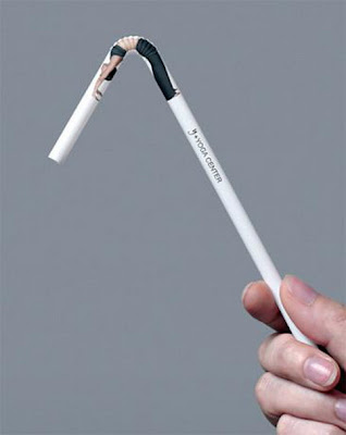
This advertisement for a yoga studio is brilliant. Yoga is all about stretching your body in different ways, and the ad involves a picture of a woman stretching on a bendy straw. This gives off the effect that the woman is extremely flexible and shows how this yoga studio is extremely effective. Because the advertisement is on a straw, rather than a traditional print or interactive ad, it also gives off the effect that this yoga studio is unique. I would definitely choose a yoga studio that had a nontraditional or guerilla campaign like this rather than a yoga studio that had normal print ads or billboards. Especially with so much clutter that's going on in the world, this straw campaign is great. Imagine how hilarious it would be to walk down the street and see people drinking from straws that had pictures of people stretching on them! Definitely a great campaign that will gain a lot of attention.
Long Copy
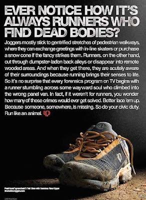
I'm personally not a huge fan of long copy ads, because even if they are really witty and well-written, I probably wouldn't take the time to read it, unless I was really invested in the product being advertised. The reason why I really like this long copy ad is because it's not selling a product, but a concept. It's saying that people should start running again. The problem is that who made the ad (which company or health and wellness group) is not clear. The headline is very eye-catching, which is why I decided to actually read the entire advertisement rather than skim through it or just pass right over it. In high school I was on the track team, which makes this ad even more interesting to me, because it's true! The anecdote described made me laugh out loud: that runners run through creepy back alleyways and other areas that normally people wouldn't go by themselves. The last lines of the long copy are really clever too. This advertisement is basically saying that it is your duty as a citizen to be a runner because running helps saves life. I believe that the entire ad is a metaphorical pun, It is trying to portray the point that running saves lives because it is a healthy sport that gets your muscles working, rather than the fact that you find bodies on the ground. This is a very unique approach to running because it is making it a personal challenge to better the world. The thing I have learned about runners is that they LIKE to run. Those who are not interested in running won't usually go running for fun. Actually, they will probably REFUSE to go running! However, this advertisement is making running a duty to the community. Without a lot of copy, this message wouldn't have been portrayed strongly, and the ad would not be effective at all. The anecdote and wittiness of the entire long copy message totally makes the entire advertisement.
Cheers!
Jen
Friday, October 1, 2010
Verbal Solutions
In 4th grade every science teacher does the “density experiment” where you mix liquids with different densities and see how they separate. So everyone who completed 4th grade knows that water and oil don’t mix! Try as you might, shaking the concoction or rolling it about, the two liquids just won’t mesh together. That’s what makes this advertisement for Gorilla Glue so great. Through the use of just two words, H20 and Oil, we get a really strong message. The 0 is split between the two words and is basically saying that Gorilla Glue is strong enough to do the impossible: bind water and oil together. The ad is visually appealing since the words are written in large font in the middle of a blank page. This would definitely catch my attention if I were flipping through the pages of a magazine. Also, the company logo is centered right below the words: the lovable and recognizable gorilla. This is one of the simpler ads I have seen, but one of the most effective.
Through witty and sarcastic humor, Hoggie’s, a furniture store in Nova Scotia, uses solely words and a picture of just one chair to show off its traditional and vintage style. The copy on all of the ads makes me laugh and really displays the fact that Hoggie’s doesn’t like modern-looking anything. They are all for the vintage style of back in the day. For example, the copy on one ad reads “Where can you find a chair made in 1924? Our modern section. What’s new at Hoggie’s? Absolutely nothing.” This was definitely an unexpected twist to the advertisement that I didn’t expect the first time I read it. The typeface chosen also fits the message really well. All the letters have “cracks” and faded color in them to give off the olden effect. The background of the ad looks like old parchment paper, which also gives off the “vintage” style without coming straight out and saying it. I do have one complaint about these ads, however. I found them on Ads Of The World one right next to each other, and the typeface, color scheme, and overall feel of the advertisements are the same in all the ads. These factors makes me believe that the three ads are a part of a campaign., however, I don’t really see a big connection between the three. Yes, they all use the “old” humor, but they all have completely different taglines. For example, one of them has the main tagline as “Hell is a home without Hoggie’s,” while the concept of “hell” was not even touched upon by any of the other advertisements in the campaign. I think there needs to be more than just a similar look tying the ads together to consider it a campaign.
These advertisements for Geek Squad have the tagline "Before it gets nasty..." The advertisements use the beginning of offensive statements as the main attention-grabber. For example "Motherf...." is shown in one of the ads. I won't finish the statement here, but everybody knows what curse word the advertisement is alluding to. This campaign is really clever because everybody can relate to getting annoyed when something electronic isn't working. The Geek Squad caught on to this insight and decided to play off of those angry and frustrated emotions that they try to fix. Just like the first advertisement I discussed, the words are centered on the page and really stand out since there is no other visual or verbal sections. However, the ads might be a little controversial because the advertisements are alluding to negative statements. Even though they don't go out and actually SAY these bad words,if a little kid saw this advertisement, he/she might not understand it correctly and go around saying the curse words.
Friday, September 24, 2010
Outdoor Advertisements
There are so many great billboards out there that I had a hard time choosing just 3 to write about! Billboard advertisements have a wide reach, and depending on the location, can have a high frequency. Let's say you take the same route to work every morning. This means you would pass the same billboard. And if there's traffic (rush hour perhaps?) you will be even more inclined to really understand the billboard message because you will have more time to look at the ad.
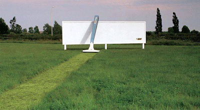
This first billboard is my favorite. It is an advertisement for BIC razors and shows a razor acting as a lawn mower. It really hits home for me because it took me a long long time to actually find a razor that I liked. This advertisement really makes BIC seem like the best because the "shaved" portion of the grass is perfectly straight with no nicks. If I saw this while driving on the highway it would definitely catch my attention, especially since the "shaved" grass is light colored.
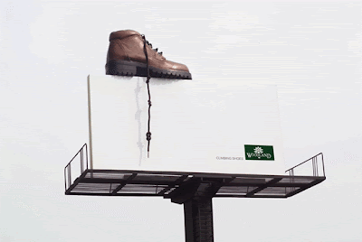
This is an advertisement for Woodland Climbing Shoes. It uses a pun by having knots tied in the shoelaces, insinuating that both the shoes (and shoelaces) are strong since you can climb to the top. Since the rest of the advertisement is completely white, the shoelace dangling from the top really stands out. It will catch the attention of someone driving by on a highway, and it will make people focus 100% of their attention on the shoe. The problem with this is that if you don't really know about different shoe brands, and you're driving by quickly, your attention might only focus on the design of the shoe without actually knowing which brand it is.
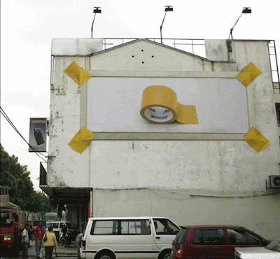
This billboard shows the effects of super masking tape. It is three-dimensional because a roll of tape is actually sticking out of the middle of the billboard. The technique "show the effects" is used because it appears as though four pieces of tape on each of the corners is actually holding the billboard up. Obviously this is not true (a billboard is MUCH heavier than something tape can hold), but the exaggeration is beneficial and proves that the tape is stronger than most others. Obviously a normal brand of regular scotch tape wouldn't be able to hold up the billboard. Again, the issue of branding is a problem here. What is the brand of this particular strong tape? It is not really made clear, which can be problematic if there are multiple companies that produce this tape. That would mean this advertisement is promoting the product category rather than the product itself.
And an extra bonus, this is just brilliant and hilarious.
Sunday, September 19, 2010
Visual Solutions
Samsung
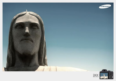
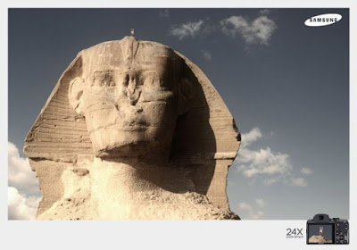
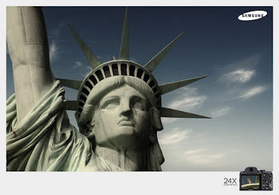
This series of Samsung advertisements uses strong and great quality pictures as the main focus. This is a great technique, especially for this particular campaign since it is promoting cameras. By showing very famous and popular landmarks around the world (Statue of Liberty, the Sphinx, etc), and focusing on only the heads of these landmarks, it shows how great the Samsung camera is: "it can zoom really well, it can take pictures really clearly, and I know that because these landmarks look just like the way I see them in textbooks and from professional photographs." Also, I didn't actually notice this until looking at the advertisements a third time, but above each of the shots of the landmark, there are two fingers (as if someone is giving it bunny ears). Then, in the product shot on the bottom right corner, you see the "bunny ears" in the camera lens. Again this shows how the camera can really zoom in. This is a good advertisement because even without seeing all the parts (like me not noticing the bunny ears at first), the message is still strongly conveyed.
Mals Printing House
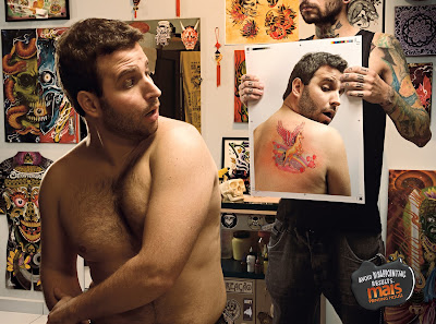
This advertisement for a printing house uses a humorous image. There is a man sitting in an intense tattoo parlor: on the walls there are pictures of skulls and Satan and other hardcore things. Then you see that the man looks horrified when he sees that the tattoo he just got on his back is a unicorn flying through a rainbow with tons of tiny hearts. The unicorn image contrasts with the masculine and intense images that are around the store, and the look of shock on the man's face is funny because he clearly didn't want that tattoo. In the bottom right corner there's just one little tag line that says "Avoid Disappointing Results." I'm not 100% sure what a "printing house" actually is, but from this advertisement I can see that the printing house is promising not to mess up an order like this tattoo parlor clearly did. It is effective because without many words, the person seeing the advertisement is forced to focus on the image, and because the image is funny and strong, the person seeing the advertisement knows what to expect from the company.
Raid
This advertisement for Raid Max spray has a striking (and disturbing) visual. I hate bugs so the advertisement kind of freaks me out, seeing as there are a ton of spiders forming the shape of a flashlight. However, someone like me who hates bugs might actually spend more time looking at this advertisement. The thought going through my head is "if this spray can kill all these bugs, let me have it!" There is a tiny tag line in a crack of the floor saying "One shadow they came to fear." This tagline explains the visual even further: the bugs are afraid of the spray and must shine a flashlight where the can's shadow would fall because they are so afraid of it and would rather not look at it. Obviously a fake flashlight can't get rid of a shadow, but the exaggeration shows how effective the Raid Max must be. Also, the product shot is taken a certain angle that really emphasizes the strength (by showing it really tall and almost as though if it were human it would be sticking out its chest) of the product. The visual would definitely capture the attention of someone who is having a bug problem or is interested in ways to kill the little creatures.
Sunday, September 12, 2010
Creative Tactics
Ads of the World has so many great advertisements. I literally spent an hour just looking through them. Here are a few of the ones that really stuck out in my mind:
Storytelling
This series of advertisements for a Belgian newspaper tells a lot of stories. Protesters are being taken away by the police in all the pictures, and from the facial expressions and the brutality portrayed, I can only imagine what the people must have been going through. For example, the woman in one of the pictures is wearing a pink shirt that says “Women For Peace”. Her veins are popping and it looks like she’s screaming. It’s ironic that she’s rallying for peace and is being captured and forced away by police. In another one of the pictures, a man is forcefully being dragged by his arms. There’s a poster in the corner saying “Stop the…” (we can’t see the rest) which means that he was obviously fighting for something he believes in. Again, the viewers of the advertisement can try to imagine a whole story behind the picture. That’s why the tagline is so effective. It’s saying that instead of rallying and protesting and doing other dangerous things, the best way to share your opinion is to write to the newspaper.
Double Meaning
I interpreted the next two advertisements as having a double meaning. One shows watermelons in the shape of a bunch of grapes, and the other shows a lot of tomatoes in the shape of a raspberry. The advertisement is for a refrigerator that has a lot of space. By emphasizing the images on the advertisements (they are in the center with very little text, so your eye automatically jumps to the image), you can see that the fridge is big enough to fit everything. For example, it can fit grapes AND watermelons simultaneously. At the same time, the images are really appealing and make me want to go into my fridge and see what I have to eat! By playing the delicious fruit card, the advertisement is getting the viewers to think about food, and in turn, their refrigerator. That is why they have a double meaning: not only do the fruits literally have double meaning (they could be interpreted as either or), but the advertisement itself makes you think all about your fridge.
Disturbing Imagery
This advertisement has an interesting concept, but at the same time the image is a little disturbing. It is a llama made of clay, which looks a little too human-like. It looks as though the llama has human skin (very pale skin, but still human). The copy in the advertisement is written in the shape of two humps on the llama's back, which if taken literally, makes the clay figure a camel. Aside from the disturbing image of the animal, I like the humor and cleverness in the advertisement. Since chiropractors help ease back, neck, and other kinds of pain, the advertisement portrays the image that the chiropractor is good at his job by eliminating the animal’s humps. It’s even as if the animal changes from a camel to a llama. This ad would definitely catch someone’s attention, but I don’t know if it would make someone want to go see that specific doctor.
Cheers!
-Jen
Tuesday, September 7, 2010
First post
Hello all!
This is the first entry on my first advertising blog, which will hopefully be the first of many. I'm a senior Advertising major at the S.I. Newhouse School of Public Communications at Syracuse University. I created this blog for my Portfolio class, but am looking forward to updating it. I'm excited to begin analyzing and critiquing ads, and especially to conceptualize and create my own advertisements. Check back here for some creativity, critiquing, and some of my own ideas.
-Jen
Subscribe to:
Posts (Atom)