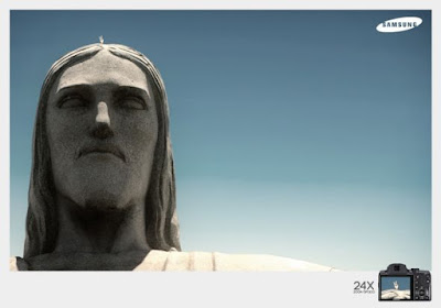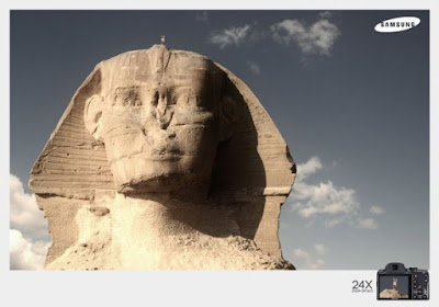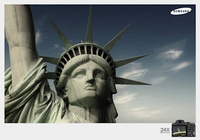


This series of Samsung advertisements uses strong and great quality pictures as the main focus. This is a great technique, especially for this particular campaign since it is promoting cameras. By showing very famous and popular landmarks around the world (Statue of Liberty, the Sphinx, etc), and focusing on only the heads of these landmarks, it shows how great the Samsung camera is: "it can zoom really well, it can take pictures really clearly, and I know that because these landmarks look just like the way I see them in textbooks and from professional photographs." Also, I didn't actually notice this until looking at the advertisements a third time, but above each of the shots of the landmark, there are two fingers (as if someone is giving it bunny ears). Then, in the product shot on the bottom right corner, you see the "bunny ears" in the camera lens. Again this shows how the camera can really zoom in. This is a good advertisement because even without seeing all the parts (like me not noticing the bunny ears at first), the message is still strongly conveyed.
Mals Printing House

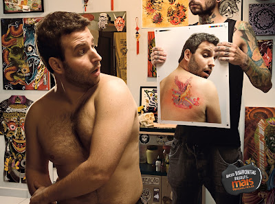
This advertisement for a printing house uses a humorous image. There is a man sitting in an intense tattoo parlor: on the walls there are pictures of skulls and Satan and other hardcore things. Then you see that the man looks horrified when he sees that the tattoo he just got on his back is a unicorn flying through a rainbow with tons of tiny hearts. The unicorn image contrasts with the masculine and intense images that are around the store, and the look of shock on the man's face is funny because he clearly didn't want that tattoo. In the bottom right corner there's just one little tag line that says "Avoid Disappointing Results." I'm not 100% sure what a "printing house" actually is, but from this advertisement I can see that the printing house is promising not to mess up an order like this tattoo parlor clearly did. It is effective because without many words, the person seeing the advertisement is forced to focus on the image, and because the image is funny and strong, the person seeing the advertisement knows what to expect from the company.
Raid

This advertisement for Raid Max spray has a striking (and disturbing) visual. I hate bugs so the advertisement kind of freaks me out, seeing as there are a ton of spiders forming the shape of a flashlight. However, someone like me who hates bugs might actually spend more time looking at this advertisement. The thought going through my head is "if this spray can kill all these bugs, let me have it!" There is a tiny tag line in a crack of the floor saying "One shadow they came to fear." This tagline explains the visual even further: the bugs are afraid of the spray and must shine a flashlight where the can's shadow would fall because they are so afraid of it and would rather not look at it. Obviously a fake flashlight can't get rid of a shadow, but the exaggeration shows how effective the Raid Max must be. Also, the product shot is taken a certain angle that really emphasizes the strength (by showing it really tall and almost as though if it were human it would be sticking out its chest) of the product. The visual would definitely capture the attention of someone who is having a bug problem or is interested in ways to kill the little creatures.
No comments:
Post a Comment