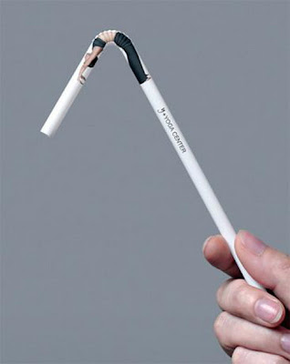
Guerilla advertising is one of my favorite types of advertising. Since it is nontraditional and always extremely creative, it's really fun to see guerilla ads rather than traditional ones.
Guerilla Ad
This advertisement for a yoga studio is brilliant. Yoga is all about stretching your body in different ways, and the ad involves a picture of a woman stretching on a bendy straw. This gives off the effect that the woman is extremely flexible and shows how this yoga studio is extremely effective. Because the advertisement is on a straw, rather than a traditional print or interactive ad, it also gives off the effect that this yoga studio is unique. I would definitely choose a yoga studio that had a nontraditional or guerilla campaign like this rather than a yoga studio that had normal print ads or billboards. Especially with so much clutter that's going on in the world, this straw campaign is great. Imagine how hilarious it would be to walk down the street and see people drinking from straws that had pictures of people stretching on them! Definitely a great campaign that will gain a lot of attention.
Long Copy
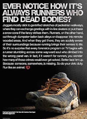
I'm personally not a huge fan of long copy ads, because even if they are really witty and well-written, I probably wouldn't take the time to read it, unless I was really invested in the product being advertised. The reason why I really like this long copy ad is because it's not selling a product, but a concept. It's saying that people should start running again. The problem is that who made the ad (which company or health and wellness group) is not clear. The headline is very eye-catching, which is why I decided to actually read the entire advertisement rather than skim through it or just pass right over it. In high school I was on the track team, which makes this ad even more interesting to me, because it's true! The anecdote described made me laugh out loud: that runners run through creepy back alleyways and other areas that normally people wouldn't go by themselves. The last lines of the long copy are really clever too. This advertisement is basically saying that it is your duty as a citizen to be a runner because running helps saves life. I believe that the entire ad is a metaphorical pun, It is trying to portray the point that running saves lives because it is a healthy sport that gets your muscles working, rather than the fact that you find bodies on the ground. This is a very unique approach to running because it is making it a personal challenge to better the world. The thing I have learned about runners is that they LIKE to run. Those who are not interested in running won't usually go running for fun. Actually, they will probably REFUSE to go running! However, this advertisement is making running a duty to the community. Without a lot of copy, this message wouldn't have been portrayed strongly, and the ad would not be effective at all. The anecdote and wittiness of the entire long copy message totally makes the entire advertisement.
Cheers!
Jen
Saturday, October 23, 2010
Friday, October 1, 2010
Verbal Solutions
In 4th grade every science teacher does the “density experiment” where you mix liquids with different densities and see how they separate. So everyone who completed 4th grade knows that water and oil don’t mix! Try as you might, shaking the concoction or rolling it about, the two liquids just won’t mesh together. That’s what makes this advertisement for Gorilla Glue so great. Through the use of just two words, H20 and Oil, we get a really strong message. The 0 is split between the two words and is basically saying that Gorilla Glue is strong enough to do the impossible: bind water and oil together. The ad is visually appealing since the words are written in large font in the middle of a blank page. This would definitely catch my attention if I were flipping through the pages of a magazine. Also, the company logo is centered right below the words: the lovable and recognizable gorilla. This is one of the simpler ads I have seen, but one of the most effective.
Through witty and sarcastic humor, Hoggie’s, a furniture store in Nova Scotia, uses solely words and a picture of just one chair to show off its traditional and vintage style. The copy on all of the ads makes me laugh and really displays the fact that Hoggie’s doesn’t like modern-looking anything. They are all for the vintage style of back in the day. For example, the copy on one ad reads “Where can you find a chair made in 1924? Our modern section. What’s new at Hoggie’s? Absolutely nothing.” This was definitely an unexpected twist to the advertisement that I didn’t expect the first time I read it. The typeface chosen also fits the message really well. All the letters have “cracks” and faded color in them to give off the olden effect. The background of the ad looks like old parchment paper, which also gives off the “vintage” style without coming straight out and saying it. I do have one complaint about these ads, however. I found them on Ads Of The World one right next to each other, and the typeface, color scheme, and overall feel of the advertisements are the same in all the ads. These factors makes me believe that the three ads are a part of a campaign., however, I don’t really see a big connection between the three. Yes, they all use the “old” humor, but they all have completely different taglines. For example, one of them has the main tagline as “Hell is a home without Hoggie’s,” while the concept of “hell” was not even touched upon by any of the other advertisements in the campaign. I think there needs to be more than just a similar look tying the ads together to consider it a campaign.
These advertisements for Geek Squad have the tagline "Before it gets nasty..." The advertisements use the beginning of offensive statements as the main attention-grabber. For example "Motherf...." is shown in one of the ads. I won't finish the statement here, but everybody knows what curse word the advertisement is alluding to. This campaign is really clever because everybody can relate to getting annoyed when something electronic isn't working. The Geek Squad caught on to this insight and decided to play off of those angry and frustrated emotions that they try to fix. Just like the first advertisement I discussed, the words are centered on the page and really stand out since there is no other visual or verbal sections. However, the ads might be a little controversial because the advertisements are alluding to negative statements. Even though they don't go out and actually SAY these bad words,if a little kid saw this advertisement, he/she might not understand it correctly and go around saying the curse words.
Subscribe to:
Posts (Atom)